GrantTap field guide · · 16 min read
Make mobile agent control readable and recoverable
A practical accessibility workshop for meaningful statuses, stable scrolling, large text, voice drafts, notifications and deliberate actions.

Supervising an agent from a phone is an attention problem before it is a screen-size problem. You may open a request while walking between meetings, return after a connection interruption or read a long tool result with enlarged text. An interface that relies on a tiny colored dot, a fleeting animation or a button whose target has changed makes an ordinary decision harder than it should be. The same weaknesses become more serious for someone using a screen reader, voice input or limited dexterity.
This guide describes a practical way to evaluate mobile agent control through GrantTap. It is a workshop, not a claim that every current screen has passed a formal accessibility audit. The proposed checks cover understandable states, stable navigation, recoverable actions and honest confirmation. They are useful whether you are reviewing an approval, checking a message or deciding that a change needs a larger display. Where the current product has a limitation, record it as a limitation and preserve a workable path instead of assuming that a polished screenshot proves an accessible experience.
Begin with the decision the person needs to make
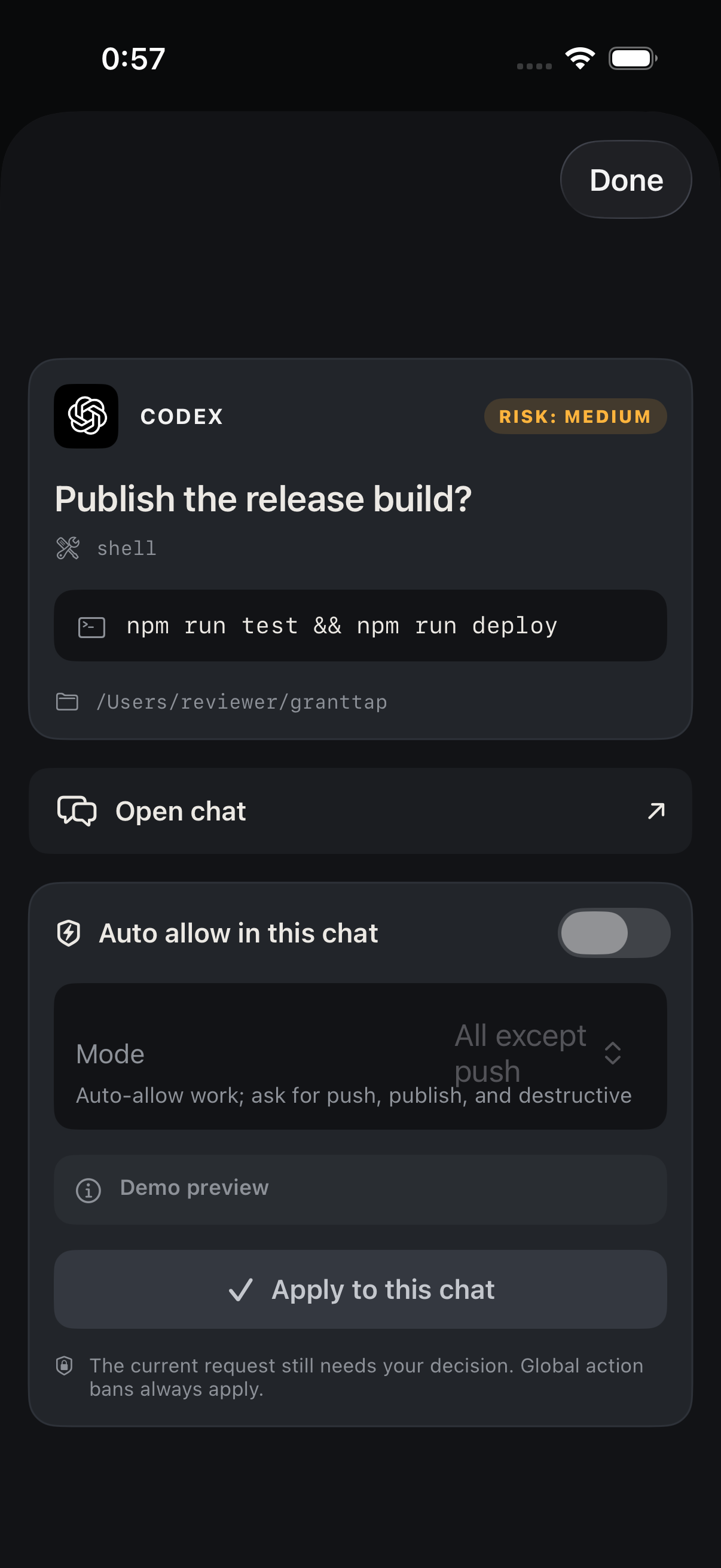
Choose a real task, such as deciding whether an agent may run a prepared command in a particular workspace. Identify the minimum facts needed: action, target, current execution, relevant effect and any important uncertainty. Those facts should be available before the decision controls. A long transcript can provide background, but it should not be the only place where the command's actual directory is visible. If the user cannot identify the target, asking them to approve faster is the wrong optimization.
For a first workshop, use a harmless fixture request in a nonproduction workspace. Prepare a known expected outcome and explain that the request is test data. Then inspect the interface under ordinary conditions before adding complications such as larger text, reduced motion or a screen reader. Keep observations concrete. A note saying the target path is clipped at a particular text size gives a developer something to fix. A note saying the interface feels inaccessible is less useful unless it is connected to a specific decision the user could not complete.

Give every status a readable meaning
Status should explain what has been observed, not merely project activity. A saved message, a computer receipt and agent activity are different facts. The GrantTap delivery guide describes those stages. If the screen says working while only the relay has saved a message, the user can reasonably believe the agent has started when it has not. Use the details view to establish which stage is confirmed, then report any mismatch between the visible summary and the underlying evidence as a concrete usability problem.
Do the same for an approval or settings change. Sending a decision and receiving confirmation that it took effect are separate moments. The interface should preserve that distinction through a disconnect or a return from the background. For the workshop, intentionally interrupt the test connection and observe what the person can still understand. Do not convert a missing response into a success message. Clear uncertainty is usable information: it tells the user to inspect the original request rather than keep tapping a button whose previous effect remains unknown.
Use color as reinforcement
A colored indicator can help someone scan a list, but the meaning should survive without that color. Read the screen in grayscale or ask someone to describe the state using only visible text and shape. A green dot beside a computer can indicate an observed connection state without saying that every provider is authenticated or every execution is active. The label should identify the actual fact. A color legend buried in another section does little for a person deciding what a request means right now.
Try the same exercise with queue and failure states. Can the user distinguish saved, received, waiting, failed and unknown without comparing subtle shades? Can they identify which message each state belongs to? Record a case where two materially different states look identical. The purpose is not to invent more badges. It is to make each important distinction legible through concise text, consistent placement and accessible semantics, while keeping secondary technical detail available for the moments when the user needs to investigate further.
Make status changes available without stealing focus
The W3C explanation of WCAG 2.2 status messages describes how important updates can be made available to assistive technology without requiring focus to move to the message. That principle is directly useful in an agent workflow. A delivery confirmation should be perceivable, but it should not unexpectedly remove the user from the command they are reviewing. For a native app, assess the platform's actual accessibility behavior rather than copying web markup and assuming the result is equivalent.
In a controlled test, start reading a request with a screen reader and then trigger a status update from the test computer. Observe whether the update is announced, whether the reading position survives and whether repeated progress updates become disruptive. Log the actual device, operating-system version and build. A Simulator screenshot cannot establish what a real device's spoken interaction did. If the announcement is missing or excessively repetitive, describe the specific transition so the implementation can be improved without making every background event an interruption.
Keep the user's reading position stable
Live updates should not continuously pull a person away from the content they are reading. Open a long transcript, scroll to an older command and let new activity arrive. Observe whether the screen preserves the chosen position and offers a clear way to return to the latest message. Repeat the test in a long repository picker or a file list where updates can reorder entries. A user who cannot reach a lower item because the list repeatedly returns to the top cannot complete the task, regardless of visual polish.
Distinguish an intentional jump from an accidental one. Opening a specific request can legitimately move to that request; a background refresh should not silently replace the current selection. In the workshop record, describe which event triggered the movement and whether the keyboard was visible. Include a short recording if it clarifies the sequence, after removing private content. A still image often misses this kind of failure. The acceptance check is that the person can continue reading or selecting while new data arrives, with an explicit control for moving elsewhere.
Test text size with actual task content
Use long repository names, a realistic command, a path with several directories and a message in the languages the product supports. Increase text size through the platform settings and inspect the actual decision path. A short demo title rarely reveals clipping, overlapping controls or an approval button pushed out of reach. Check that the user can still identify the action and target, read the relevant effect and reach the controls without an awkward combination of hidden scrolling and a persistent keyboard covering the bottom of the sheet.
Do not treat a smaller font as the automatic fix for dense content. A command may need a scrollable detail view, a readable line-breaking strategy or a way to inspect the full value. The summary should retain the essential target even when the command is long. For a phone review, the best solution may be to provide a compact explanation and preserve access to exact details rather than trying to display every byte at once. Record which information is abbreviated and how a user can recover the full value before deciding.
Make control labels describe their effect
Refresh, retry, send now, stop, cancel and dismiss are not interchangeable verbs. Refresh should inspect the original state without creating another operation. A retry may have side effects and therefore needs the original operation's identity and actual recovery semantics. Stop applies to a running action where supported; dismiss can hide a notice without stopping anything. The message-queue guide and request-recovery guide explain the relevant product distinctions. Check them against the state currently visible on the device.
In a workshop, ask a second person what they expect each control to do before they tap it. Then compare that expectation with the observed outcome in the fixture. If send now leaves a duplicate queue entry or a refresh creates another message, the issue is behavioral as well as linguistic. A clearer label cannot repair a duplicate operation. Record the original identifier, observed transition and number of resulting entries. That creates a useful bug report and prevents a cosmetic redesign from being mistaken for a complete correction of the underlying flow.
Provide enough space for deliberate interaction
Controls should be reachable and distinguishable under realistic phone use. Test with one hand, enlarged text and the keyboard present. Pay attention to adjacent actions whose consequences differ, such as opening delivery details and deleting a queued item. A tiny icon may look tidy in a screenshot while producing accidental taps in use. Do not invent a compliance claim from a visual estimate; use the relevant platform guidance and actual measurements if the team is conducting a formal assessment of touch targets or spacing.
For the practical workshop, document whether the user can complete the intended action without repeatedly correcting accidental selections. If a control is disabled, the reason should be available rather than communicated only through a faint appearance. A person should be able to tell whether an action is waiting for the computer, unavailable for this provider or missing required input. This is especially important in remote administration, where repeated tapping can create uncertainty about whether a request was sent. Good feedback reduces both frustration and unnecessary duplicate attempts.

Treat voice input as a draft that needs review
Voice can make it easier to prepare a message, but technical names, file paths and negations need inspection before sending. Dictating do not publish and receiving publish changes the task materially. Use a test message containing a repository name, a provider name and an explicit limit. Read the resulting draft and confirm that the send action remains deliberate. The relevant Files and voice chapter describes the current product path; a microphone icon alone does not establish recognition quality for your language or environment.
Design a correction path that works without discarding the whole draft. The user should be able to edit a mistaken identifier and understand which Task will receive the message. If recording or transcription fails, preserve whatever draft is available and explain the failure. Do not turn a partial transcript into an instruction automatically. In a multilingual team, test the actual mix of ordinary language and technical terms rather than assuming that a successful English sentence establishes the same reliability for Russian, Ukrainian or a sentence that switches languages midstream.
Use notifications as a route into context
A notification can alert the person to a request, but it is a limited view of the underlying work. After opening it, verify that the app shows the intended request and its current state. A notification delivered earlier may refer to an action that has already completed, expired or been handled elsewhere. The opening path should recover context rather than invite a second decision on stale information. The notification guide and request-recovery instructions are useful references when documenting the expected behavior.
Test from a locked phone, an already open app and a backgrounded app. Use a harmless fixture and record the actual transition rather than assuming all notification routes behave identically. If the encrypted request has not arrived, the loading state should explain the limitation and provide a recoverable path. A permanently disabled retry control is not a useful destination. Keep the decision pending until its actual content is available. A user should never need to guess what they are authorizing from a truncated notification title alone.
Keep the watch surface appropriately narrow
A watch can make a timely alert convenient, but its display and input model impose additional limits. Assess the supported GrantTap watch workflow from the Devices and Watch guide and test the actual companion setup. Do not assume that a control visible on the phone exists on the watch or that every detailed command is suitable for review there. A useful watch interaction may be to notice a request and open the phone for the decision that needs more context.
In the workshop, define which actions are appropriate for the small surface and which require continuation elsewhere. Preserve the selected Task and request identity during that transition. If the watch cannot obtain the current request, it should not turn a cached summary into a new authority. Record connection and companion requirements as observed conditions. This is a practical usability boundary, not a judgment about whether small devices are capable: the point is to match the decision's information needs with the surface that can present those needs clearly.
Recover after interruptions without losing intent
Remote work includes calls, app switching, network loss and a computer that becomes temporarily unavailable. Prepare a test in which the user begins reading an approval, leaves the app and returns after the underlying request changes. The interface should identify the current state and preserve unsent text where supported. It should not submit a decision merely because the app became active again. If a request is no longer valid, explain why and show an appropriate next step instead of leaving the person in a sheet that appears actionable.
Apply the same discipline to settings changes on a selected computer. A restart or sign-in action should keep its target clear after navigation. GrantTap's device-management chapter describes the current maintenance controls and their confirmation limits. When testing an interruption, use noncritical fixtures rather than restarting a computer that is doing unrelated work. The acceptance question is whether the user can understand what they intended, what was actually sent and what the computer confirmed after they return, without reconstructing the sequence from memory.
Separate product findings from test-environment findings
A missing spoken announcement, an unreachable control and an unsupported provider capability are different findings. Record them separately so the team can choose the right correction. Include the device, build, settings, provider and the shortest sequence that demonstrates the problem. If the issue occurs only in a fixture, say so. If it has been reproduced on a physical device, include that evidence without implying that every device and operating-system version was tested. Good accessibility work depends on specific observations, not broad claims of universal coverage.
Keep the report small enough to act on. Name the user decision that failed, the relevant interface state and the expected recoverable behavior. Include a screenshot for visual clipping and a recording or interaction notes for timing and focus issues. Review these artifacts for private project names, commands and account details before sharing them. A well-prepared report can guide a coding agent toward the correct screen and transition while leaving room for a human to assess whether the resulting behavior actually serves the person who encountered the issue.
Finish with an ordinary successful journey
After correcting a problem, repeat the complete journey that motivated the change. Open the request through its normal entry point, identify its target, inspect the details, make the intended decision and wait for the actual confirmation. Repeat with the relevant text size or assistive technology enabled. A unit test or a static preview can support the change, but the full path demonstrates whether the pieces work together. Preserve any remaining limitations so the next release does not silently inherit an untested assumption.
The most useful mobile control surface lets a person understand the agent's state, choose a concrete action and recover when the connection or their attention changes. That benefits everyone, including users who do not identify as needing accessibility features. It also improves the quality of remote engineering decisions: fewer mystery statuses, fewer accidental repeats and more explicit evidence about what happened. Treat these checks as part of normal product work, while using the current GrantTap guide for released behavior and keeping workshop recommendations distinct from capabilities that have already been independently verified.