Practical agent workflows · · 15 min read
Light, Dark and Auto: a website theme that keeps its promise
GrantTap’s website as a practical case study: system changes, explicit overrides, storage failures, first paint, cross-tab updates and readable technical pages.

An automatic theme sounds like a small feature until you use it across a real product website. The home page looks right, the guide opens with a bright flash, a code example becomes unreadable, and a second tab ignores the preference you just changed. None of those failures requires a complicated application. They happen when theme selection is treated as a button that swaps a background instead of a relationship between user intent, system appearance, persistent storage, initial rendering, and every component that owns a color. A useful theme makes that relationship predictable before it makes the page decorative.
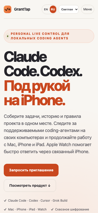
GrantTap's website provides a practical case study because it combines a landing page, a long guide, technical articles, pricing, legal information, and existing product screenshots. Readers may arrive directly from search rather than through the home page. They may prefer light pages during the day, follow their system automatically, or keep a deliberate dark override while their operating system changes. This article explains the implementation decisions and the acceptance checks behind Auto, Light, and Dark. It describes website behavior, not a new native-app theme setting. The accompanying generated illustrations explain concepts; actual browser captures are identified separately and should not be mistaken for images generated to resemble a working interface.
Try a focused check
Use a dedicated test Task and the intended authorized working directory.
Check Auto and explicit choice
Choose Auto and switch system appearance. Then choose Light, switch the system again and verify that the explicit choice wins.
Open another tab
Change the preference in one tab, inspect the other, reload it and verify the saved selection.
Read a long page on mobile
Check headings, muted captions, code blocks, focus and navigation in both modes. A screenshot taken after loading does not prove there was no initial flash.
Separate the saved choice from the displayed appearance
Model the preference as three values: auto, light, and dark. Model the resolved appearance as only light or dark. In Auto, the system's current preference determines the resolved value. An explicit Light or Dark choice remains explicit even when it happens to match the system. This distinction matters when the system changes later. If you save only the resolved color, a person who selected Auto while their computer was dark can become accidentally locked to Dark for future visits. The interface would preserve yesterday's observation rather than their actual choice.
Keep the visible selector synchronized with the saved preference, not with whichever colors happen to be displayed. In a dark system, Auto and Dark can look identical while promising different future behavior. A three-option control makes the promise inspectable. A binary sun-and-moon button cannot communicate the same state without additional interaction or explanatory text. The control should have a clear accessible name and keyboard support. On a narrow screen it must remain usable beside language and navigation controls without pushing the page wider than the viewport.
Write the resolution rule once and use it throughout the site. Otherwise the guide, marketing header, and legal footer can independently interpret a missing value, an old setting, or an unexpected string. Validate stored values against the three supported choices. Unknown values should produce a safe default rather than being copied into class names or attributes unchecked. The result is a small state model that is easy to test and explain: the visitor chooses a preference, and the site derives the current appearance from that preference plus the system when appropriate.

Make Auto respond while the page stays open
Auto should respond to the operating system without requiring a reload. The browser's prefers-color-scheme media query provides the system preference that a website can observe. web.dev's guide to the media query covers the mechanism and its relationship to page styling. In an application with an explicit override, listening to the query is only half of the behavior. The change handler must re-evaluate the saved preference before applying the system's new appearance. Otherwise a deliberate Light selection can unexpectedly turn dark at sunset.
Test two contrasting paths in the same tab. First select Auto, change the emulated system preference, and verify that the page follows. Then choose an explicit Light value, change the system to Dark, and verify that the page stays light. Repeat with explicit Dark. Check both the rendered colors and the selector value. A test that merely sees a media-query listener get registered does not establish the user-facing result. The important assertion is whether the current preference produces the correct appearance after an external event.
Listeners also need a lifecycle. Register them through one site-level controller and remove them when that controller unmounts. Adding another listener on every route transition can create duplicate work and difficult-to-reproduce updates. The theme itself should not require a network request, an account, or a persistent connection to a local coding agent. It is a browser preference for reading the site. Keeping that boundary simple improves reliability and avoids making an ordinary visual choice depend on unrelated product infrastructure.
Persist intent and handle unavailable storage
A returning visitor expects an explicit preference to survive navigation and reload. Local storage is a straightforward place for that browser-level setting, but reads and writes can fail. Privacy settings, restricted contexts, or storage limits should not prevent someone from changing the current page. Wrap access deliberately, validate what was read, and preserve an in-memory choice if writing fails. A readonly store may still return an old value after a failed write; reading it immediately must not silently undo the user's new selection.
The useful fallback is modest. The selected appearance continues to work in the current page, while durability across future visits may be unavailable. Do not display a dramatic application failure for a nonessential preference. Do not claim persistence succeeded when it did not. This behavior belongs in tests because a happy-path browser profile rarely exercises it. Create a scenario where storage returns an earlier preference but rejects the new write, then verify that the control and page retain the visitor's new selection for the active session.
If the site previously had a guide-only theme key, define an explicit migration rule. A valid new global preference should win. When no valid global value exists, a valid legacy guide choice can provide continuity. Invalid legacy data should not create a fourth state. Document the migration in code and cover the precedence once. Without a shared rule, visitors can experience the home page restoring one preference while the guide restores another, even though both are individually using persistent storage correctly.
Synchronize tabs without creating an event loop
Changing a theme in one tab should update another open tab for the same site when the browser makes that storage change available. The browser's storage event is designed for changes made in another document sharing the storage area; it is not sent back to the window that performed the change. That distinction is documented in the MDN storage-event reference. A complete implementation therefore handles the local change directly and the other-tab change through its own listener.
Do not make every listener write the value back into storage. An observer normally needs to update its local view, not become another author of the same preference. Keeping writes at the explicit user action avoids loops and unnecessary events. When receiving an external event, validate the new value and resolve Auto against the receiving tab's current system observation. If storage was cleared, follow the documented default behavior. Test the cleared state as well as ordinary Light-to-Dark changes; missing values are part of the interface contract.
Use two real browser pages in the acceptance test. Set an explicit preference in the first, verify the second changes, reload the second, and confirm that it retains the same selection. Then return both to Auto and change the emulated system appearance. A single-page unit test can verify event-handling branches, but the two-page scenario proves that the browser integration works. Keep both forms of evidence: narrow tests make regressions easy to locate, while the browser test confirms that the real storage and document boundaries agree.
Apply the initial theme before the page paints
A page that first renders in the wrong theme and corrects itself after hydration can produce a conspicuous flash. This is especially unpleasant on a dark screen at night. Read the small validated preference early and apply the resolved appearance to the document before the main content paints. Keep this bootstrap focused on appearance. It should not fetch user data, parse large application state, or wait for an agent connection. The amount of work needed to choose two color palettes is tiny.
Server rendering creates another constraint: the server does not automatically know a preference stored only in a visitor's local storage. The initial HTML and client controller need a deliberate agreement about the root attributes they own. A narrowly scoped hydration-warning suppression on the expected root appearance difference is different from hiding arbitrary mismatches throughout the page. Verify that title, language, headings, links, and article content still arrive correctly in raw HTML. Appearance initialization should not postpone the useful content until JavaScript finishes.
Check a cold direct visit to a guide chapter and a blog article, not only a client-side transition from the home page. Record the initial document appearance under both system settings and a saved explicit override. A test that waits several seconds before taking a screenshot can miss the flash entirely. Separately test the settled page for layout and contrast. Initial rendering and final rendering are different acceptance conditions; one screenshot taken after everything stabilizes cannot prove both.
Use semantic colors instead of scattered replacements
Define colors by their roles: page background, panel, primary text, secondary text, border, accent, focus indicator, and status. Components should consume those roles rather than embedding independent dark assumptions. A light palette often reveals hidden hardcoded values in captions, inputs, code panels, and separators. Search the actual styles, but validate the rendered result too. A text search cannot tell whether a composited foreground and translucent surface produce sufficient contrast, especially when several layers affect the final color.
Avoid blind string replacement of color literals. A short hexadecimal sequence can appear inside a longer token, and a replacement can leave malformed CSS that the browser silently ignores. Convert complete declarations or well-defined variables, then inspect computed colors on representative components. Keep code examples readable in both modes, including selected text and horizontal scrolling. An article can look polished at the top while its most useful diagnostic command becomes nearly invisible farther down. That is a functional failure for a technical guide, not merely a cosmetic inconsistency.
Preserve the brand accent without requiring every accent-colored paragraph to carry meaning. Delivery status, warnings, and success should also use words or icons so that color is not the only signal. A theme change must not turn an error into an ambiguous orange dot. Check interactive states such as hover, keyboard focus, disabled controls, and native select menus. Tokens provide a shared vocabulary, but components still need inspection because their geometry and interaction affect how those colors are perceived and used.

Keep screenshots truthful and illustrations intentional
A real product screenshot contains its own captured colors. Recoloring it automatically to match the surrounding website can misrepresent the application or make text illegible. Keep the image intact and choose a frame that works around it. Label historical screenshots with their actual context when a guide needs to retain an older view. The website's Light option should not imply that an older native screenshot was recaptured in a light native theme. Readers need to know which pixels are evidence and which are part of the article's design.
Generated editorial illustrations can deliberately use a palette that sits comfortably in both modes. That does not make them interface evidence. Give them descriptive captions explaining the concept, and identify them as illustrations. For a theme case study, a useful trio might show preference selection, automatic resolution, and a verification setup. The images should add a distinct idea rather than repeat the same decorative arrangement three times. Keep the actual website capture separate, with its capture date and environment available in the editorial record.
Inspect image loading and surrounding surfaces on a mobile connection. Large screenshots can dominate an article's weight, while a decorative asset may unintentionally delay the main heading or share card. Use appropriate dimensions and formats, reserve layout space, and keep informative text in HTML. A reader should not need to zoom an image to obtain the core acceptance checklist. Images support the explanation; selectable headings, commands, and captions keep the article useful to people, assistive technology, and search systems.
Test the page families, not just the home page
A global preference has a global acceptance surface. Include the home page, article index, a long article, guide index, guide chapter, pricing, support, legal content, and any existing control surface that shares the appearance layer. Test direct entry and navigation. The same header can appear against different backgrounds, while embedded forms and code panels may have their own styles. Use a small representative matrix first, then investigate any family with a distinct component rather than duplicating every route mechanically.
For GrantTap, a useful matrix combines narrow mobile and desktop widths with Light, Dark, and Auto. Include both English and Russian pages because text length changes header geometry and control placement. Check that the document does not overflow horizontally, the appearance control remains reachable, article navigation works, and no text disappears behind a fixed element. Automatic screenshots can catch obvious differences, but inspect representative captures yourself. A perfectly valid CSS declaration can still produce an awkward mobile header or an unreadable muted caption.
Do not equate a headless Chromium pass with every physical browser. It gives repeatable evidence for that engine and configuration. Safari, mobile browser chrome, native dropdown presentation, and accessibility settings can introduce differences. Record the environment actually checked and retain a short manual acceptance list for other targets. This is more useful than a universal claim that everything works everywhere. The purpose of a matrix is to make important behavior visible and repeatable, not to manufacture certainty beyond the environments you exercised.
Keep search metadata independent of appearance
Light and Dark are reading preferences for the same page. They should not create competing indexable URLs or separate article identities. Keep canonical links, translated alternates, publication dates, structured data, and headings stable while the appearance changes. A social share card should be legible as its own image because the receiving platform does not inherit the visitor's local theme setting. Build a dedicated landscape card rather than assuming a tall application screenshot will crop into a useful search or messaging preview.
Check page language from the URL and actual content, independently of theme storage. A visitor who opens the Russian article should receive Russian content and metadata even when their local browser previously viewed the English home page in Dark. These are separate preferences with different URL implications. A theme listener must not rewrite language or navigation. Conversely, a language link should retain the browser's appearance preference without inventing a second persistent key for each locale. Separating the responsibilities makes both accessibility and search behavior easier to reason about.
After a release, verify the public raw HTML, share-image response, sitemap, and article links as well as the browser interface. A local source test does not prove that a production image includes the new assets. Record the deployed revision and compare visible output with the tested candidate. Search rankings and indexing are external outcomes that cannot be guaranteed by a successful deployment. The concrete improvement you can demonstrate is a coherent, accessible page with accurate metadata and stable content across its supported appearance states.
Write acceptance conditions a future maintainer can repeat
Keep the final checklist behavioral: Auto follows a live system change, explicit choices ignore that change, reload retains a successful save, another tab observes a new preference, blocked storage does not undo the active choice, and direct navigation starts in the intended appearance. Add readable text, visible focus, mobile layout, intact screenshots, and unchanged canonical identity. These statements explain what must remain true even if the framework, storage helper, or component structure changes. Tests tied only to a particular implementation name are less durable.
The best result is an ordinary experience. A reader opens GrantTap's guide in their preferred appearance, follows a command, navigates to an article, and keeps reading without thinking about theme state. Achieving that calm experience requires attention to the seams between small systems: server HTML, browser storage, media queries, component styles, and editorial assets. The work is worthwhile because it makes technical information easier to use. Treat the preference as a clear contract, verify its transitions, and retain honest evidence of the environments tested when you publish the finished page.